Templates and Designs Available in AurCard
A template sets the first impression in under two seconds. Here is how to pick one that fits your field and what ruins a design on a phone screen.
Business Basic plan · 46 SAR a month, billed yearly
A template decides the first impression before a single word is read, and choosing one is simpler than it seems: pick the highest contrast, the clearest ordering, and your own brand colours if you have them — then stop thinking about it and move on to the content. The range of templates tempts you to spend a long time comparing them. But the honest thing to say early is that the difference between a card that works and one that does not is almost never the template. It is the clarity of what is written and the order of the buttons.
A template does exactly three things
Defining its job precisely stops you spending more energy on it than it deserves.
It sets the first impression. A visitor forms an initial judgement in under two seconds, an involuntary one about seriousness and attention to detail.
It orders where the eye goes. Whatever sits at the top and whatever stands out in a different colour is read first. The template makes that decision for you.
It ties the page to your identity. When your page carries your logo's colours, anyone who has seen you before connects it to you without noticing.
What it does not do: it does not make a vague bio clear, does not convince anyone of an incomprehensible service, and does not compensate for a number nobody answers.
The criteria that actually matter
Contrast above everything. Dark text on light or the reverse. Low-contrast designs — pale grey on white, say — look refined on a desktop monitor and become unreadable on a phone in sunlight. That is a very real scenario in Saudi Arabia: a customer standing outside your shop at midday trying to read your page.
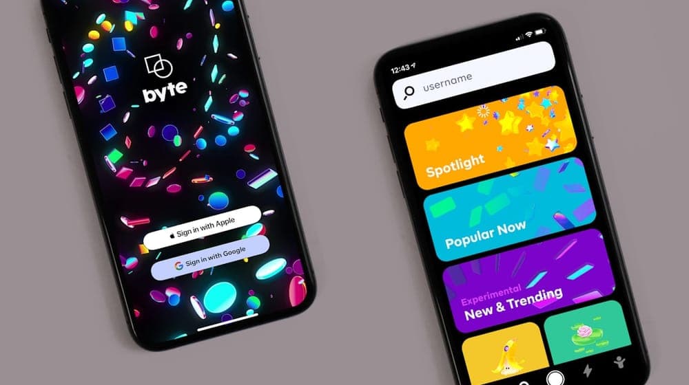 Photo by charlesdeluvio on Unsplash
Obvious buttons. Call and save-contact must be visible without scrolling. A template placing a full-screen image at the top pushes the buttons out of the first view.
Photo position. Near the top, where the eye lands first.
Legibility. A type size that needs no zooming, with comfortable line spacing.
Direction handling. If your page is Arabic, it must read right-to-left throughout: text, alignment and button order — not Arabic text inside an English layout.
What suits each field
This is not pure taste; every field carries a visual expectation among its audience.
| Field | What suits it |
|---|---|
| Consulting, law, finance | Restrained design, few colours, formal ordering |
| Health and clinics | Light clean colours, high clarity, prominent booking |
| Restaurants and cafés | Strong imagery, warm colours, menu up front |
| Salons and beauty | Elegant design, white space, work photographs |
| Contracting and industry | Direct design, dense information, project photos |
| Creative and design | More freedom; the design is itself part of the pitch |
The general rule: the more serious the decision your client is making, the more restrained the design should be. Someone choosing a financial adviser is looking for steadiness; someone choosing a café is looking for atmosphere.
Colours: two are enough
The most common mistake here is using too many.
The working rule: one primary brand colour, a second for important buttons, and grey for secondary text. That is the whole requirement.
If your company has a visual identity, use its colours rather than the template defaults — that matters more than any other aesthetic choice, because it ties the page to everything else you publish.
And note that your primary brand colour is not necessarily a good button colour. A very pale or muted shade gives a button too little prominence. In that case use the brand colour in the visual elements and something higher-contrast for buttons.
Setting up a full identity is covered in unified visual identity for companies.
Typefaces and Arabic
The Arabic typeface deserves particular attention, because it is the biggest single difference between a page that reads as local and one that reads as translated.
The practical criteria: clear at small sizes, harmonised with the English face if your page is in more than one language, and not decorative in body text — ornate faces are lovely in headings and exhausting in paragraphs.
The decisive test: open your page on a phone and read your whole bio. If your eyes tire before the end, the typeface or its size needs changing.
What ruins a design on a phone
These are the faults an owner never sees, because they design on a computer and are viewed on a phone:
A huge uncompressed image making the page slow, a problem that compounds in premises with weak coverage.
Long text with no breaks, which becomes a grey block from which three lines get read before it is abandoned.
Too many adjacent elements, making precise tapping difficult.
Colours too close together, so a button looks like part of the background.
Weak contrast, which disappears in sunlight.
The test that exposes all of it: open the page on your phone, outdoors, in daylight. Whatever stays readable there is readable anywhere.
Images matter more than the template
A practical point widely missed: the quality of your images affects how your page looks more than your template choice does.
 Photo by Jakub Żerdzicki on Unsplash
An excellent template with a poor photograph produces a worse result than a plain template with a good one. The reason is that a photo occupies more visual space than any other element and sits at the top where the eye lands first.
The same applies to product and work images: a set with inconsistent lighting and angles makes a page look improvised however elegant the template, while a consistent set — even at moderate quality — looks deliberate and organised.
The rule: consistency beats production values. Ten images matched in lighting, background and angle outperform five professional ones and five random. The criteria for a personal photograph are in choosing a photo for your digital card.
Element order matters more than the template
After choosing a template comes a more important decision: what appears first?
The top of the page is valuable space, and what sits there is read many times more than what sits below. So it should hold whatever you want the visitor to do, not whatever you want to say about yourself.
For a clinic: the booking button. For a restaurant: the menu. For a real estate office: available units. For a consultant: a contact method and a two-line bio.
The common error is placing a long company history at the top, forcing visitors to scroll past it to reach what they came for. Long descriptions belong lower down, for people who want to read after finding what they needed.
This is not a one-time decision either: revisit it after a month based on which buttons are actually pressed, and move the most-used one up.
Do not change templates often
Advice that runs against the natural urge: once you have chosen a template and set your colours, leave it alone.
Frequently changing appearance destroys what repetition builds. Someone who saw your page twice in two different forms builds no visual association with you, whereas consistency builds gradual recognition.
The reasons that justify a change are few: a company rebrand, a genuine legibility problem you discovered, or a fundamental change in what you do.
What does not justify one: boredom, or seeing a design you liked somewhere else.
Start with content, not the template
The order that saves you time: write the content first, then choose the template.
Starting with the template leaves you adapting your words to fill the design's gaps, producing a bio written to fit a space rather than to convince a reader.
Starting with the content tells you exactly what you need: a page with substantial text needs a design with comfortable spacing, while an image-led page needs a template that shows images well.
Writing the content itself is covered in how to write a professional bio.
A three-step final check
Before committing to your template:
One: open the page on another phone, ideally a different platform.
Two: show it to someone who does not know your work and ask what you do and how to reach you. Any hesitation points to ordering rather than colours.
Three: look at the page from arm's length without reading. What stands out? If it is the background image rather than your name and buttons, adjust.
With AurCard you can switch templates and adjust colours at any time, and the change appears immediately without your link or QR code changing.
Read next
An auto-reply that does not annoy: how to write your after-hours messages
Four messages the owner writes once — the welcome, after hours, the menu, the handoff — and what makes a customer feel a person is behind them.
Subscription and Payment: Common Questions
Subscription questions repeat in similar forms: billing cycle, currency and VAT, payment methods, refunds, upgrades and renewal. Here are direct answers to the most frequent ones.
Which AurCard Plan Fits Your Business? Business Basic vs Business Pro
The difference between AurCard's two plans is not the kind of tools but the size: how many employees, branches and admins. Here is how to choose without paying for capacity you will not use.